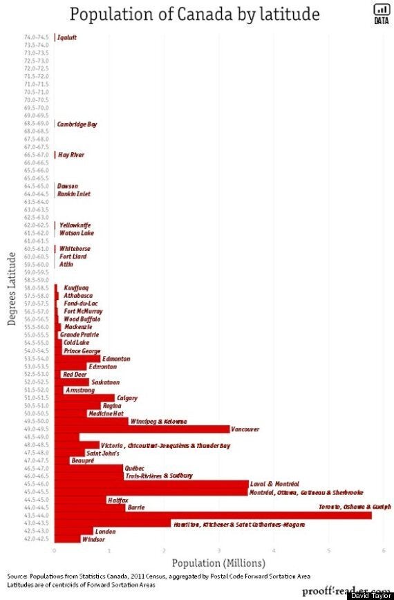
Most of us know roughly how many people live in Canada, but do we know exactly how many of them live where? Well, we have a better idea now, thanks to David Taylor, who compiled a graph using StatsCan population data and posted it on Reddit.

Some of the data isn't surprising, like how the vast majority of our population live in the lower half of the degrees latitude, or that more people live in the Toronto, Oshawa and Guelph area than anywhere else in Canada. But it is pretty fascinating that Victoria is further north than Barrie.
Also, barely anyone one at all lives between 69 and 73.5 degrees latitude. Look at the graphic again. Pretty barren up there, hey?
Taylor writes on his blog, where the graphic first appeared, that the data comes from 2011 StatsCan census data, which can be viewed by Forward Sortation Areas (FSAs), the first three letters of a postal code.
He sought the help of a colleague at the university where he works, who used mapping software to determine the 'centroid', or geographic centre, of each FSA. Taylor then matched each centroid with its closest degree of latitude, and found the biggest population centre in that latitude range.
Taylor is quick to write it's a rough estimate, as some cities -- like Edmonton -- straddle latitude lines and that the labels are there to give context, not function as an absolute point. Still, given the obstacles Taylor faced, the image he produced is still cool.
Like this article? Follow us on Twitter
Also on HuffPost
