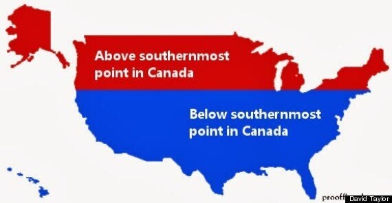
Many of us think of the United States as our neighbours 'to the south', but a new infographic might make you think differently.
David Taylor, the part-time geographer who brought us Canada's population by latitude has devised a map that shows a significant portion of the U.S. lies north of our southernmost point.

The red area comprises 22 per cent of the contiguous U.S., according to Taylor's website, 38 per cent including Alaska. It also makes up 15 per cent of the country's population.
He told the Huffington Post Canada by email that he got the idea for the graphic after he viewed a map of latitude and longitude as it stretches across the earth.
"A few clicks in, and I realized my mental image of the geographical relationship between Canada and the United States and Europe was wildly off."
He said his interest in designing these graphics comes from a challenge he faces in his field of genomics -- making a lot of complex information accessible to the public.
"We now have the technology to produce and statistically analyze terabytes and terabytes of data, but it's a challenge to visualize it all so it can be communicated to the public, funding agencies and even other scientists."
What do you think? Was this a surprise, or did you know it already?
Also on HuffPost