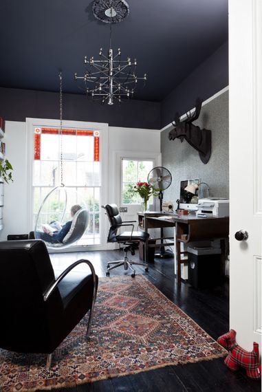
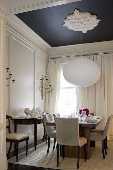
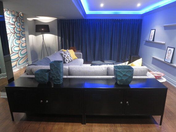
In the 21st century, we spend a lot of time looking down -- obsessively checking our phones, typing away at our computers, or absorbed in a TV screen. Every now and then our point of view needs a little refreshing, which is why I wanted to focus on the "forgotten" wall of interior design -- the ceiling! Take inspiration from the many possibilities for stunning treatments you can find outside the 4-walled box, and treat yourself to a design that helps keep you looking up.

Painter's Canvas:
-To give an airy feeling, I often recommend painting the ceiling the same shade as the walls and trim, with a difference in finish used to create subtle variety -- especially in older homes with imperfect ceiling lines, as the consistency helps hide flaws. Benjamin Moore's OC-23 Classic Gray is a great staple neutral, and I often use it in a matte finish for large surfaces with the trim in satin.
-However, the ceiling can also be an opportunity to make a room-transforming statement. I recently had a client's ceiling painted Benjamin Moore's Beau Green #2054-20, a jewel-toned greenish-blue pulled from a lively wallpaper. This sort of ceiling treatment visually lowers the ceiling, which suited the client's dining space (and also works well in small spaces you visit briefly, such as a powder room).

In The Papers:
-The name "wallpaper" suggests that the treatment is reserved solely for vertical surfaces, but who says it can't also dress the wall above you? A paper treatment overhead brings a sense of rich detail in an unexpected place, creating a focal "wall" you can enjoy from all angles (so find a design that works in at least two directions, such as a stripe, geometric, texture, or all-over organic pattern).
-Like with paint, a wallpaper ceiling treatment can either create a subtle richness or an eye-catching focal point. For lower ceilings, try a soft-hued, textural treatment, such as a taupey grasscloth, to add a luxe feeling detail that won't dramatically shrink the room. For a very high ceiling, consider applying the paper to both the ceiling and to the upper walls (above a line of moulding or panelling).

First Place Medal(lion):
-A classic design detail which has become a strong returning trend, ceiling medallions create a visual focal point overhead, which can then either enrich the look of a simple white surface or break up a more dramatic treatment. They can be minimal circles or elaborate forms, and either match or contrast your crown moulding: a more complex piece works well against a modern light fixture, while a very intricate chandelier may be best with a more sleek and simple accompaniment.
-Traditionally a medallion is located over the electrical supply of a pendant light, but this does not mean the pendant *must* be centred on the medallion - trailing the electrical cord to a separate suspension line offset from the medallion allows the light to be centred over a seating group or table, and creates an industrial modern detail which contrasts the traditional decoration. (If the electrical supply is very far away, the medallion could be centred on the light with the power cord trailed away instead.)

Support System:
-Ceiling framework can feel like a traditional or modern detail, depending largely on the material used. Rustic or worn-in wood beams, running either in one or both directions across the ceiling plans, will give a barn-like charm, while dark stained or metal options will produce a more modern look.
-The "coffered" ceiling is a design feature that dates back to ancient times, where it still holds up in buildings like the Greek Pantheon - the grid of recessed squares always gives a luxe look. Treated in all white, this effect does not have to dramatically drop the look of the ceiling, as much of the room will remain at full height. For even more drama, painting either the dropped portions or the flat surface in a punchy colour highlights this architectural detail.

A Few More Ideas:
-Gold leaf: with a little DIY elbow grease, you can give a space a royal treatment that also lends your upward aiming light fixtures (and thus the entire room) a warm glow.
-Pressed tin: whether true panels or a synthetic alternative, a tin or copper ceiling grid gives a vintage charm that recalls the Victorian Era.
-Coved ceiling: rather than a complex set of coffers, one single cove (in the centre of the room or over a key area) gives you a place to tuck a few potlights or led strips, and breaks up the plane (which can then be painted or papered in smaller chunks).
-Dropped panel: the opposite of a cove, dropping a portion of the ceiling can provide space to house electrical fittings for lights that otherwise might not have been possible, while visually defining the zone below.

Interior by Toronto Interior Design Group
And of course, for even more design ideas, you can always visit my website at tidg.ca.