Print news is a reportedly dying industry and publications are looking for new ways to hold onto their readership.
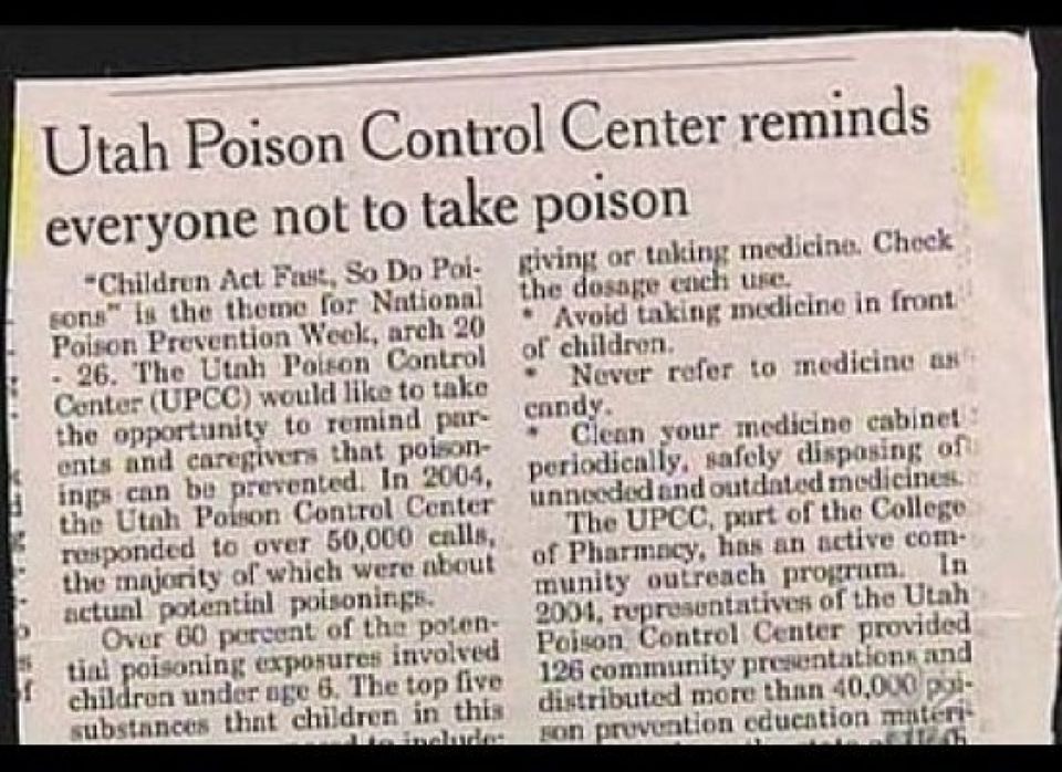
Creative design is one way to go about it, but we're thinking this isn't quite the way to do it.
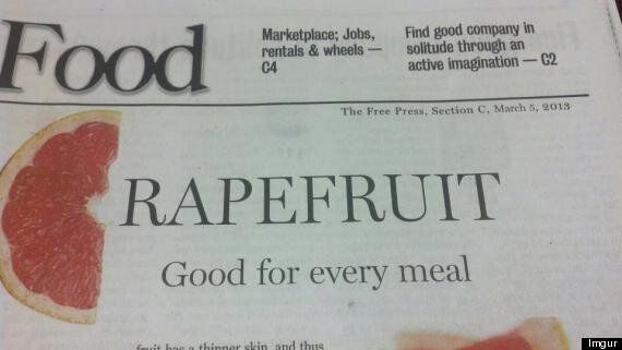
This unfortunate headline is making the rounds on social media:

Published in Minnesota's Mankato Free Press on March 5, the grapefruit slice is meant to look like a 'G,' but with a casual glance the headline looks like... well, something else. Although we don't think we're alone in thinking that the slice looks more like a 'C' anyway.
The Free Press responded with a post entitled 'Next time, we'll just use the G,' acknowledging the "unfortunate headline."
“Obviously, in hindsight, we would have done this differently,” said Jim Santori, publisher of The Free Press.
Twitter users jumped on the poorly-thought-out layout with jokes like this:
You can read more of the mostly off-colour humour over on Twitter.
We're not sure who approved this huge headline fail, but we are sure that "rapefruit" is not good for every meal.
Also on HuffPost
