Colin and Justin spin the colour wheel and discover that clever tonal selection can influence your mood and create the home of your dreams...
What's your favourite colour? Red? Green? Pink? Well, if certain academics are to be believed, you're already predisposed, from the moment of conception, to enjoying particular tones. Biological "colour memory," you see, is, apparently, passed through DNA. Or in other words, if your grandmother loved blue, you're biologically pre programmed to feel the same way. One word from us: WHATEVER.
Genetic programming aside, here's a peek at what colour can actually do for your psyche and some advice, to boot, on how to use colour to get the best from your environment. Observed carefully, our simple guide will help you stay tonally correct.
BLUE
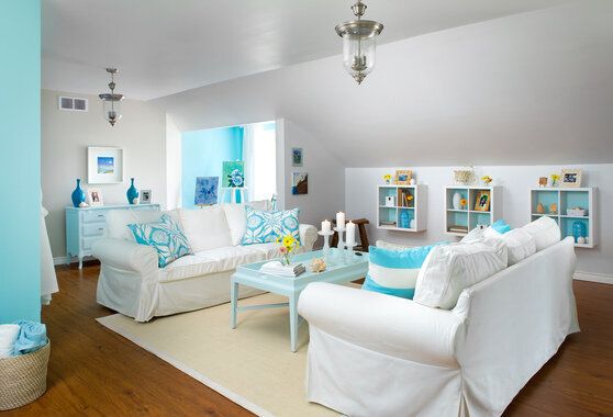
Previously considered male territory, blue has come full circle and now appeals to both genders in equal measure. Depending on shade intensity, blue can soothe and relax, making you feel spiritual and centred. Also perceived as a refreshing and invigorating tone, blue is a particularly relevant choice for bathrooms and laundry areas. But there's more! Blue is also reported to aid concentration so, if you want your kids to sail though their homework, you know what to do...
RED
If you crave a rise in sexual response, make red your colour of choice. Thought by many to have the opposite effect to blue, red has even been shown to increase blood pressure. But be careful -- use it as an accent rather than your dominant colour; a little, after all, goes a long, long way. Variants? Well, deep reds promote appetite and conversation, making them great for dining rooms, whereas orange-red and brown-red shades (like terracotta and brick) are cozy, warming and stimulating. So now you know.
YELLOW
The colour of sun, yellow may help you feel happy and has been shown to increase metabolism. However, it's also been noted that people become hot headed and babies cry more often in yellow rooms. So perhaps not ideal (certainly in brighter tones) in nurseries. Great, however, for kitchens and bathrooms, especially when teamed up with white.
GREEN
The colour of the forest, green calms, relaxes and can have a healing effect. What's more, it's also said to relieve depression and anxiety. But don't use too dark a tone otherwise your home will end up feeling like the local library. Sage, olive and lime are currently very popular and hey, even pastels are making a comeback. Pastels? Yup; they'll be coming atya, in decorating terms, for summer 2014...
ORANGE
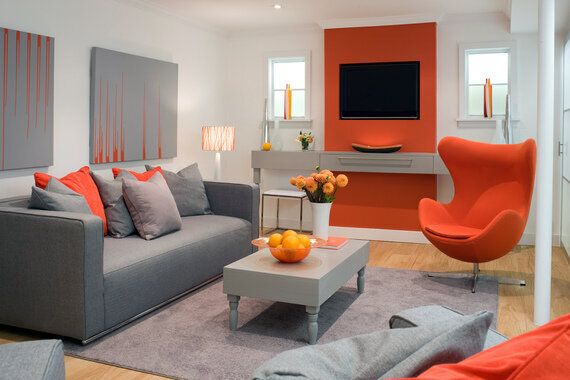
Orange is warm, welcoming, and vital and, whenever we get the opportunity, we set the juice loose. We still adore Tangerine Tango, previously Pantone's Colour Of The Year. Whether melon, Satsuma or mango, we literally can't help ourselves - we use this colour everywhere. In kitchens, bedrooms and dining rooms (balanced with white) we find the palette invigorating and uplifting. So, too, do many of our clients who regularly request that at least some element of the tangy shade is played across their homes.
PURPLE
Ah -- the colour of kings. And, ahem, queens. Hush, now! Opulent, mysterious and seriously spiritual, purple runs a huge register from eggplant and lavender to the precious tones of amethyst. Saturated purple is hedonistic and rich and provides a dramatic punch where required. We love mauve and lilac and disagree with other designers who suggest these tones are too girly.
BLACK
As kids, we both decorated our bedrooms naughty noir (yup, walls, carpets and curtains) much to the chagrin of our parents. Marilyn Manson, had he been chart-bound back then, would have felt very at home. These days, however, we realize the power of restraint. Played out properly (perhaps as an accent wall teamed with taupe and white accessories) black can look seriously elegant and sophisticated. Great as an upholstery choice -- we have black button tufted chesterfields in our design studio -- black can be "butch" but similarly "bitch," if teamed with mirrored furniture and crystal-encrusted accessories. It's all, we'd counsel, in the mix.
PINK
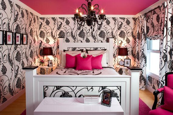
Once considered girly, pink is now enjoying a spot of dude love too thanks, in part, to bright shirted business men with a sense of sartorial fun. Colour scientists often advocate that pink be employed in prisons (to subdue aggressive behaviour) and if it works in the clink, it's sure to bring harmony to your home. But go easy...or run the risk of creating a Dolly Parton-esque marshmallow nightmare. Not too much, mind. Just a touch.
GREY
Storm clouds and rainy days -- the perfect choice for grumpy teenagers? Or a mood board inspired by city suits, military precision and elegant couture. You choose. We LOVE this palette and find it timeless and sophisticated. But better still -- the grey scale is reckoned to increase productivity in the home office. One of us, Justin, studied colour psychology as part of a degree course at Glasgow University, and the valuable information harvested back then has been so useful across our design business.
BROWN
From an economic perspective, brown wears well and is good for zones where heavy traffic is likely. Soften with accents of cornflower blue, lime or cream to provide balance. Brown also works well with spicy or warm colours such as orange and vibrant yellow.
ADDING COLOUR WITHOUT PAINTING YOURSELF INTO A CORNER
Paint one wall
Confident blocks of colour can change the focal point of your room without major decorating upheaval. Take a tip -- understand "restraint." Aye, less is generally more.
Pitch in the pillows
Use toss cushions, throws and accessories to add drama to a muted scheme. Doing this creates decorating flexibility and allows you to alter mood on a whim by replacing old accessories with new. Seasonal adjustment, in turn, will be a breeze.
Add a bit of Mother Nature
Verdant plants, flowers or even fruit add visual warmth and personality. If you're not particularly green thumbed, ask your local garden centre to recommend horticulture that requires minimal care.
Floored
A colourful rug, strategically placed in front of a chair or under your bed, will add tone and texture. Choose a contrast colour or an interesting pattern that ties into your theme and watch, in wonder, as your project room comes alive. We loves us a spot of underfoot layering!
Freshen up a chair cushion
If you have a small piece of occasional furniture, such as a desk stool or side chair, bring it to life with a staple gun and a fabric off cut. Fresh colour on a small area like this will help invigorate even the most tired scheme.
Get arty
Colourful, strategically placed art won't only add a decorative touch; it'll introduce drama and fun. Could it be the only thing standing between you and a vibrant scheme is a fabulous painting or a brightly matted and framed print or canvas? Visit www.etsy.com for a whole host of artwork, the financial mechanics of which won't send your bank manager into cardiac meltdown. Or in other words, art work that won't cost you a fortune...
Whichever colours you veer toward (and whether or not you've inherited those predelictions from parents or grandparents) one thing is certain -- colour, used correctly, can play with mood and improve your life. So happy scheming. We'll see you brightly (or perhaps subtly) hued, next time.
Photography by Brandon Barre
A Colin & Justin basement project -- juicy to the max.

A Colin & Justin bedroom design created for a young mum who adores dramatic colour.

Entering their blue period, Colin & Justin seasonally adjust a white space with pops of turquoise.

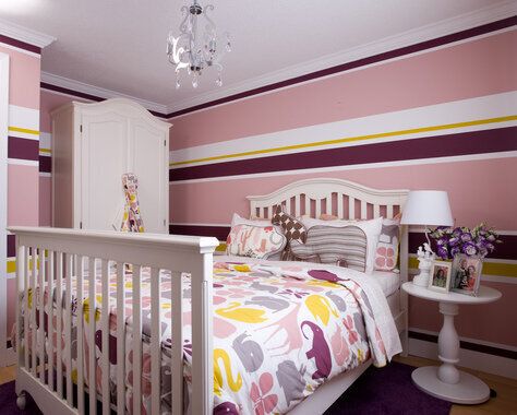
Masking tape and various paint shades were Colin & Justin's weapons of choice for this jaunty, junior domain.
