In a previous post on this subject, I showed that the distribution of incomes in Canada has trended very slightly since 1976. Although I think the dataset I used is a good start, by no means does it offer a complete perspective on the issue of income inequality. One of its limitations is with respect to the top bracket of earners. To illustrate with a hypothetical example, suppose that the proportion of earners in the top bracket did not change over time, but they captured the vast majority of income gains. This trend would not be picked up in the data I used. If instead, the majority of income gains were captured by any other bracket than the top, we would see one bracket shrinking and another growing. It is only with the top bracket that the data has this blind spot.
In part answer to this, I looked at the Gini coefficient which is a measure of income distribution. How does it work? This is the explanation from the StatsCan website:
The Gini coefficient is a number between zero and one that measures the relative degree of inequality in the distribution of income. The coefficient would register zero (minimum inequality) for a population in which each person received exactly the same adjusted family income and it would register a coefficient of one (maximum inequality) if one person received all the adjusted family income and the rest received none. Even though a single Gini coefficient value has no simple interpretation, comparisons of the level over time or between populations are very straightforward: the higher the coefficient, the higher the inequality of the distribution, and vice versa.
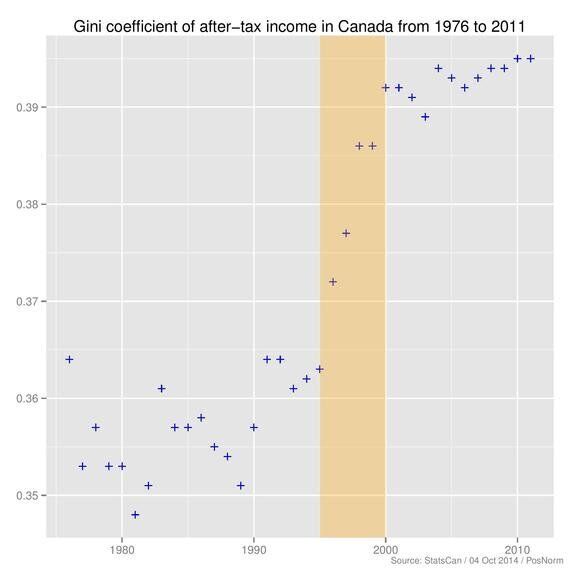
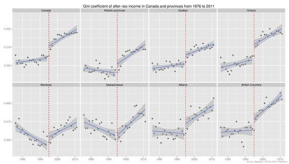
So basically, I wanted to see how this Gini coefficient has changed over time. Here are the results (click for larger image):


The Gini coefficient has increased since 1976 in Canada in each province except Manitoba and Saskatchewan. 1995 appears to mark a change in trend for income inequality in Canada and the provinces. Although the Gini coefficient increased only 8.5 per cent nationwide, between 1976 and 2011, 93.5 per cent of that change occurred between 1995 and 2000. British Columbia has the highest Gini coefficient and also the strongest upward trend. The provinces of Alberta, Saskatchewan and Manitoba have the most volatile data series.
Personally speaking, I was not surprised to see that Manitoba, Saskatchewan and Alberta have the greatest variance in data since many of their incomes are tied to agriculture and commodities which tend to be volatile industries. The strong trend in British Columbia is interesting because you hear stories of how Vancouver is a hotspot for wealth and it has an extremely expensive real estate market.
The Gini coefficient is a debated measure that has its limitations. Although it has increased, a 0.031 increase in the coefficient does not significantly change the overall income distribution function. Still, it is interesting that he vast majority of the change occurred in such a narrow window. One of the more popular reasons that I came across to explain the 1995 surge is that NAFTA was ratified in 1994. If this is the case, I wonder if there will be another surge when CETA takes effect.
The original article with R code and data used to generate the graphs can be found here
ALSO ON HUFFPOST:
