The design side of Alberta Premier Jason Kenney’s energy “war room” is having a terrible, horrible, no good holiday season.
Earlier this month, it was revealed that the Canadian Energy Centre’s logo was lifted from a U.S. software company. After profuse apologies and the turfing of the ad agency, the government centre promised a shiny new original logo. Then last week, that logo turned out to look a lot like another American company.
Graphic design certainly doesn’t seem to be the Alberta government’s forte.
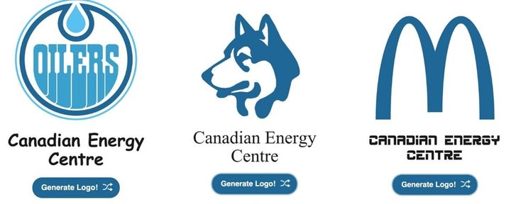
Enter staff at Goat, a Vancouver-based design agency. They created the Energy War Room Generator. Simply hit the button and out comes a totally original, definitely not taken from another company logo.

The humorous take repurposes familiar imagery and fonts into super unique logos for the Canadian Energy Centre, which was created by Kenney’s government to produce content and marketing promoting the oilsands and Alberta’s energy industry.
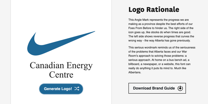
“This Angle Mark represents the progress we are making as a province despite the best efforts of our Foes From Before to hinder us,” reads the description of a familiar swoosh from the generator. “The right side of the icon goes up, like stocks do when times are good. The left side shows reverse progress that curves the wrong way — the way Alberta has gone previously.”

And those letters spelling out NASA? They’re not actually letters but a physical representation of Alberta’s mountains, rivers and the road into Drumheller.
Even the fonts have thoughtful explanations, like this one for Comic Sans: “This original wordmark creates a sense of playfulness, passion, and vibrancy — capturing the on-site energy of the men and women who work in the energy industry, bringing us everything from plastics to cars. It adds a human touch.”
“You can’t just toss things together and call that a brand.”
- Goat founder Terence Sawtell
Goat founder Terence Sawtell said the generator is meant to draw attention to the importance of good design.
“It was meant to poke fun at the fact that you can’t just toss things together and call that a brand,” he told HuffPost Canada. “The most important part of this is to, you know, highlight that good branding and good visual identities start with good research, and you need to vet the companies you work with.”
While the war room’s first logo was taken directly from software company Progress, the second is being accused of incorporating a direct element from another U.S. tech firm, ATK Technologies Inc.
The CEC boasts an annual budget of $30 million, but is not subject to Freedom of Information requests, so it remains a mystery how much was spent on the copied logos. The centre did not respond to HuffPost Canada’s request for comment.
Sawtell said the generator has approximately 20 different images and eight different fonts, meaning there are 160 different possible logo combinations.
So get designing! Nobody’s already using that circle with “Oilers” in it, right?