Last month, I blogged about Reimagining Accessibility, the international competition I've launched to find a contemporary symbol or set of symbols that will achieve the same global recognition as the International Symbol of Access.
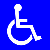
Symbol
of Access


I'm happy to say that both the competition and the blog post have had a remarkable response.
The competition, which is being administered by OCAD University in Toronto, has received well over 100 entries, not just from Canada and the U.S., but from Britain, France, Italy, Brazil, Colombia, and Mexico.
The blog post elicited a great deal of comment, including a thoughtful discussion prompted by a member of the Public Transit group on the popular social network LinkedIn.
Several of those who commented, both on the post itself and in the Public Transit group, were against the idea of changing the wheelchair symbol, noting "if it ain't broke, don't fix it" or that there are more important accessibility needs that are not being met.
Let me say, right off the bat, that I appreciate and understand the comments and the interest and goodwill behind them.
Unfortunately, however, a fair proportion of the response is misinformed. For example, the competition is not limited to design students at OCAD U. Rather, it is an international contest which, as mentioned above, has had a remarkable response from around the world.
Also, the nub of my and others' unease with the current symbol is that it excludes over 97 per cent of people with disabilities, because it is all about wheelchairs, rather than accessibility.
To those who fear that the competition is aimed at throwing the proverbial baby out with the bathwater and getting rid of the wheelchair symbol altogether: this is definitely not the case.
What I'm asking, as the name of the competition makes clear, is for designers to reimagine the concept of accessibility and to come up with a revised symbol or set of symbols that will be more inclusive.
It should also be remembered that, no matter what designs are selected as winners, there is absolutely no guarantee that they will go any further than the competition. As I stated in my original post, the selected designs will be forwarded to ISO, the International Organization for Standardization, where they will be reviewed by an appropriate committee.
That being said, let us be clear on one thing. The current international accessibility symbol is neither sacrosanct nor monolithic. Just try Googling "accessibility symbol" and see how many iterations come up!
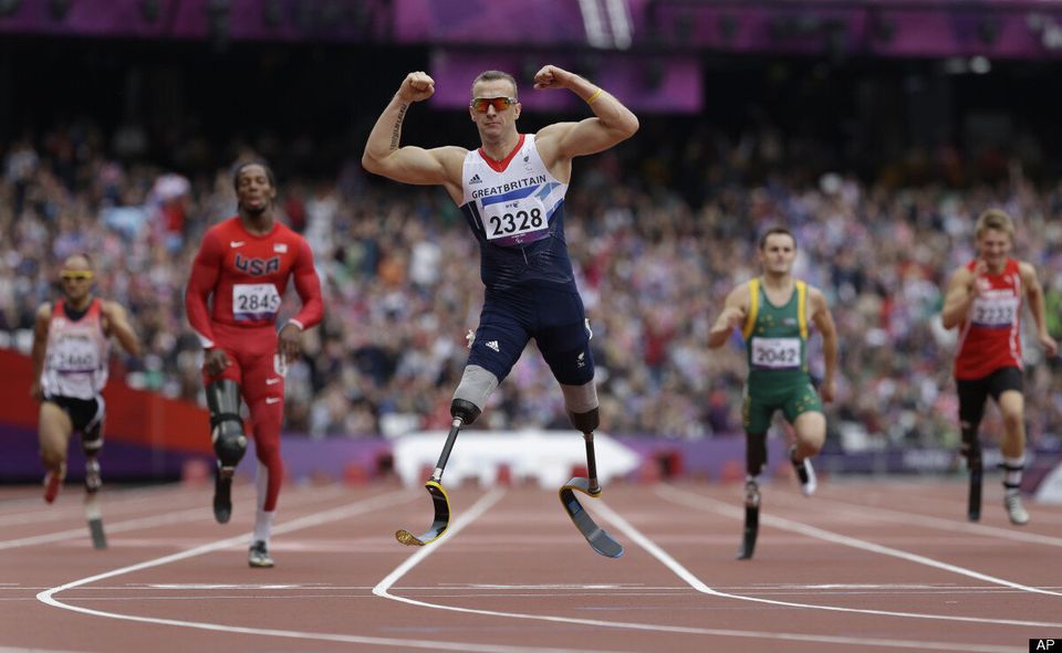
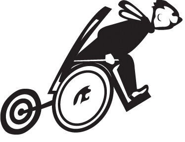
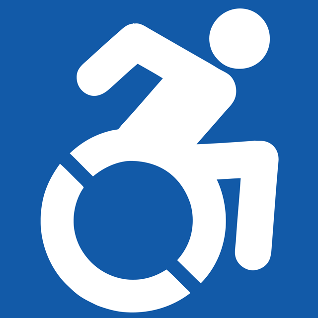
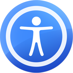
In fact, the idea of revising the symbol arose in the first place because of my own observation of multiple interpretations. Examples include the Variety Village "Walk, Roll, Run" symbol, Paralyzed Veterans of America, the Beijing Paralympics, the Accessible Icon Project, and the Apple and Microsoft accessibility icons. And these are only the ones I have seen for myself.
The Reimagining Accessibility competition did not leap fully formed from my brain. It was test marketed to a group of advocates and experts in the field, many of whom have disabilities, during a round-table discussion I hosted as part of the DEEP Conference that OCAD U hosted in Toronto earlier this year.
In a forum that included DEEP delegates, as well as members of the Ontario disability community and my disability advisory committee, the concept received a positive reaction that propelled it forward. Had the consensus been negative, I can assure you it would have died on the vine.
The competition closes this week, on October 25 and eleven outstanding individuals have agreed to serve as jurors. As can be seen from their bios on my website, between them they have a vast reservoir of expertise on disability, accessibility, human rights, transportation, architecture, design, brand identity, new media, urban planning, the arts, employment and venture capitalism.
The calibre of these jurors guarantees that the winning designs will be extraordinary. I am eagerly anticipating their unveiling, at a ceremony in Toronto on November 1 by Her Royal Highness the Countess of Wessex.
Watch this space! (And stay tuned on Twitter with hashtag #AccessSign.)
ALSO ON HUFFPOST:
