Editor's Note: The headline on this post was initially changed to a title not approved by the blogger. The original title has been restored.
The history of pictographs (pictures that resemble what they signify) and ideograms (symbols that represent ideas) is as old as humanity itself. From the earliest cave drawings, to the modern isotype, they transcend language, effectively communicating ideas and information to people of all ethnic and cultural backgrounds.
This is why pictograms have become the lingua franca of modern life. No matter where we are in the world, familiar outlines point us towards the escalator, tell us when it's safe to cross the road, and let us know whether we're heading for the airport or the docks.
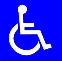
Symbol
of Access
In 1969, the universal symbol for accessibility -- a blue square overlaid in white with the stylized image of a figure in a wheelchair -- made its first appearance as a globally recognizable cryptogram when it was adopted by the Eleventh World Congress on the Rehabilitation of the Disabled.
In the previous year, the International Commission for Technical Aids (ICTA), a committee of the International Society for the Rehabilitation of the Disabled (subsequently renamed Rehabilitation International) held a design competition for a symbol to designate areas accessible to people with disabilities.
A Danish graphic design student, Susanne Koefoed, submitted the winning design: the outline of a figure sitting in a wheelchair. It was modified by the ICTA, which added the blue and white colours and gave the seated figure a head.
That final, official design -- the International Symbol of Access, also known as the International Wheelchair Symbol -- is still in use today. It is incorporated, with formal specifications as to dimensions and use, in the library of internationally recognized symbols of the ISO, the International Organization for Standardization.
When it was first introduced, it was hoped that the public would be encouraged by the wheelchair symbol to become more aware of the circumstances of people with disabilities. For those living with disability, it was to be a sign of freedom, the marker that meant buildings were accessible and parking spots available.
Long overdue, the symbol rapidly gained visibility, as commercial and cultural facilities warmed to the idea that people with disabilities also like to shop, go to the theatre and cinema, eat out, and visit art galleries.
Throughout Ontario today, as we approach the half-way point in the 20-year implementation of the 2005 Accessibility for Ontarians with Disabilities Act (AODA), the sign has become ubiquitous, as buildings, communications and services are becoming more accessible.
The AODA was a bold step by the provincial government in the direction of universal accessibility, and it is helping to advance the cause of inclusiveness in this province.
But there is still some way to go, especially when it comes to changing long held attitudes to disability. And there are many who believe that the International Symbol of Access -- with its depiction of a passive stick-figure in a wheelchair -- reinforces some of those attitudes.
Over the decades since its introduction, there have been some attempts to improve the wheelchair symbol, to make it more representative of the ways that people with disabilities function in modern society.
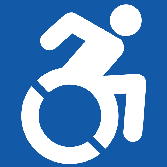
Most recently, the Accessible Icon Project in the United States has proposed modifying the symbol, to make the figure seem less passive, while still fitting within international accessibility standards.
The project's symbol is based on a design by co-founder, Sara Hendren. It depicts the wheelchair figure in motion, and has been adopted in several cities in the States, as well as in Canada and Western Europe.
I have also seen some other interesting variations on the symbol. When I was in Beijing for the 2008 Paralympic Games, I noticed that facial features and an athlete's helmet had been added to the figure in the wheelchair. Here in Toronto, the Mastermind Toys store has one sign that welcomes service animals and another with a wheelchair in motion and the words "Free Wheel In!"
All of this is admirable, but the symbol is still built around a stick figure -- not a person, but an it. People with disabilities are not objects; they are living, breathing individuals, containing within them all that distinguishes a human from an it.
But the most important problem with the International Symbol of Access is this: it is exclusionary. The symbol is all about the wheelchair -- even though the majority of disabilities are not mobility-related.
Here in Ontario, less than three per cent of the 1.8-million people with disabilities actually use wheelchairs or other mobility devices! The same small percentage applies throughout most other jurisdictions. In other words, over 97 per cent of Ontarians with a declared disability are not taken into account by any of these symbols, all of which reinforce the idea that accessibility is primarily about accommodating wheelchairs.


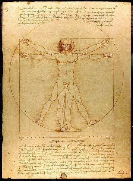
I know that there are distinct and quite widely used symbols for those with visual and hearing impairments, and it is worth noting that both Microsoft and Apple, recognizing the absurdity of a wheelchair symbol for their accessibility options, have come up with their own pictograms. Microsoft indicates Ease of Access with an icon that looks like a wheel. And Apple's Universal Access symbol resembles Leonardo da Vinci's Vitruvian Man. But none of these have the global recognition factor of the wheelchair sign.
Back in 1969, Susanne Koefoed's design prompted a quantum shift in the public's awareness of accessibility. As someone who had used a wheelchair during childhood, I remember as an adult how liberating it felt. Suddenly, there were places to park, buildings with ramps or accessible doors!
But that was then; the world has moved on, as have people with disabilities. The image that once seemed so liberating, is now limiting. And it's time for an international accessibility image that is in tune with the 21st century: inclusive, human, welcoming -- an image that increases perceptions of what should be recognized as disability. It's time to turbo-charge Blue Wheelie!
That is why, with the enthusiastic co-operation of the Ontario College of Art and Design University, I have launched an international competition to find a contemporary symbol or set of symbols that will achieve the same global recognition as the International Symbol of Access.
The competition, which is open to post-secondary students around the world, is running from September 20 to October 25 of this year. A select panel of judges will choose three final designs, which will be unveiled in Toronto on November 1 by Her Royal Highness the Countess of Wessex. Thereafter, they will be presented to the ISO for consideration. It will be up to the ISO to decide if the new symbol, or symbols, will become the new or complementary image to the traditional wheelchair sign.
I encourage students everywhere to take on this challenge and to share their involvement on Twitter using the hashtag #AccessSign. I look forward to witnessing another quantum shift in public awareness of accessibility!
