Colour trends change every year, but one thing always stays the same: people want colour, but they're afraid that if they begin to experiment, they'll end up with a colour explosion. Rather than pushing you outside of your comfort zone, I want to show you exactly how to find your personal Colour Comfort Level the easy way (with a beautiful living room set put together using IKEA furnishings and accessories). Simply begin at Level One (all neutral), and work your way into higher degrees of colour until you find the look that feels just right.
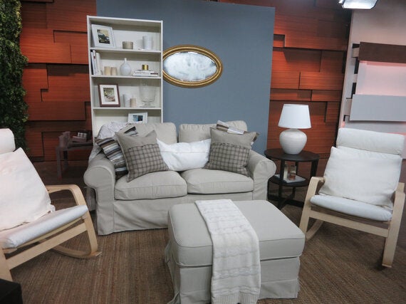
Level One: 0% Colour
-- First, let me say: sticking with neutrals can be a look itself -- I created a fully neutral set to begin this lesson on Cityline, and I would not judge anyone for stopping right there! If you prefer your colours in the form of greys, beiges, taupes, or even clean white, there are still key things to remember to keep your palette feeling sophisticated rather than just sleepy.
-- Beautiful neutrals mix well because they aren't saturated with colour, so the best way to achieve a rich look is to incorporate warm and cool greys (in dark and light shades), browns, beiges, and off-whites, and always try to include at least a small amount of stark white and deep black to get a full spectrum. You can see in my set that accents of metal (such as the gold framed Levanger mirror) and wood also bring depth to the palette - these natural materials are the neutral-lovers keys to creating depth.
-- Texture and pattern also play important roles in creating a lush look: use stripes and prints, light and rich fabrics, hard and soft materials (like stone contrasted with leather), and transparent pieces like glass or plastics and you'll have a complete look without breaking a colour-related sweat.
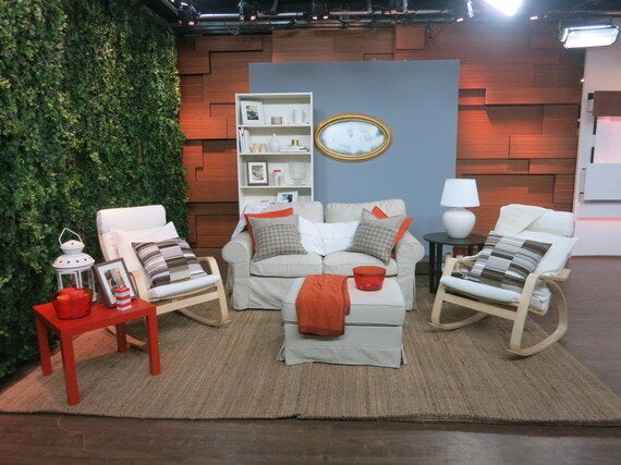
Level Two: 10-20% Colour
-- Once you've decided to embrace your colourful side, I suggest still starting at Level One. Once you have a rich base to add to, it's easy to infuse colour slowly over time until you've achieved the perfect look you can live with.
-- The safest way to begin is by choosing just one hue, so go ahead and embrace a colour you love. For my Cityline set, I selected a happy shade of orange. Start by putting your favourite colourful find in the centre of the space (a natural focal point) - try a bright throw which can be layered on any piece in your seating group. Then look for items that are similar tones, but don't worry about strict matching.
-- Pillows and other small accessories are your biggest tool here. Layer small items among your neutral pieces so the colour is diffused through the space and doesn't overwhelm you. For example, large solid pillows might seem to be shouting COLOUR at full blast, but tucked behind your neutral shams they become a subtle accent.
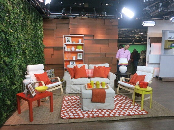
Level Three: 70/30 Split Between Two Colours
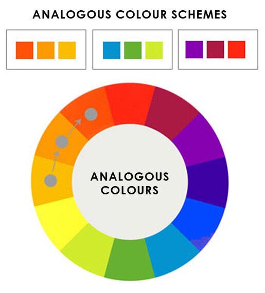
-- Once you're committed to investing in colour in a bigger way, you'll need to diversify your portfolio. To easily achieve a look that reads as colourful but not crazy, add an analogous colour to the mix -- the neighbour of your favourite on the colour wheel. In my orange example, I added yellow (yellow is one half of orange, so they're naturally suited to each other). If blue is your hue, try green or purple, and so on.
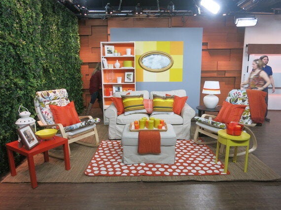
-- Make sure to continue to spread the colours throughout the space -- aim to create a triangle of colour, making sure each hue exists in at least 3 different spots, and use items containing both hues to tie the whole look together. I added yellow in candles in the centre on the serving tray, on vases on the shelves, and with the side table, so small hits float about the room.
-- Putting a lot of colour in just the centre will start to look awkward, so you'll need to make sure to put it on your surfaces as well. Drapery is an excellent way to bring colour to your walls without committing long term. You can also add art, or paint your picture frames, and include a colourful accent rug to bring life to the floor
-- I added the orange Ullgump rug over the existing rugs as a layer.
Level Four: 50/50 Split Between Two Colours
-- For the true hue believers, you can add all the colour you like, and do it safely by adding it in ways you can change over time (in case you fall in love with a new shade). Think outside the box for ways to add colour without heavy investment: I used simple Bristol board to transform a bookcase backdrop, painted an accent detail on top of the existing wall treatment, and spread throw blankets over chairs to create a new look without reupholstering.
-- In each case, you'll notice the look is still broken up with some neutrals - the wall for example is layered with the mirror so the punch of yellow doesn't totally knock you out! Bringing in pattern again will help add a more subtle richness - in this case we changed the Poang chair cover to a floral print rather than a solid, and added striped pillows to the sofa.
-- Make sure to keep a balance of the two tones throughout, and let your taste guide you through the rest. At the end of the day, colour should be something to be celebrated and experimented with, and not something to be afraid of. So start small, create your palette over time, and find your colour comfort level!
For a few fun DIY ways to add colour to your decor, check out this week's blog at tidg.ca/KeepUpWithYanic