In interior design, it can be easy to get caught up in the trends, and all the conflicting advice: one day indigo is in, the next magenta is the must have. But you know what else is easy? Picking one thing, and sticking to it!
In a world where mixing-and-matching is hot, you might find yourself growing cold on even trying to figure it all out, but I'm here to show you how to get a timeless (yet up to date!) look, all based around a favourite colour -- so easy, the hard part will be deciding on just one!

Yanic Simard on set on Cityline with IKEA furnishings
1. Building a Family
-First a definition: a "monochromatic" colour scheme is literally "one (mono) colour (chroma)," but it's important to note that this include a full range of tints, tones and shades; i.e. a spectrum of colours within one hue that include different amounts of white, grey and black.
-The first step, then, in creating a great monochromatic scheme, is to avoid being too matchy-matchy, by introducing a range of tones within your chosen colour family. On Cityline, I showed a set made from fun Ikea furnishings, in matching tones of blue -- a great start, but a bit uninspiring. Notice though how the black and white accents help accentuate the "blueness" of the set already, and give the eye some breaks.
-Introducing a lighter blue (with more white), and very saturated blue (with less grey) through the pillows and art immediately make a huge difference to how inviting the space appears. Pillows are a great tool here as you can always choose to layer them in different ways and on different furniture (or even rooms), experimenting until the look feels right.

2. Going Colourblind
-A good way to look at your monochromatic colour scheme is to ignore colour altogether for a moment and think about other ways you can add interest and drama. If you can't include new hues, you'll need other strategies to keep the space from feeling uncreative -- texture, shape, and pattern.
-Texture is always important to really feel connected to a space, so make sure to include some hard surfaces (like metal, glass or plastic), natural textures (like wood, wicker, wool, or leather) and fabrics in both soft matte and sleek silky finishes. Easy rule: contrast your sofa fabric against your pillow fabric, and choose different materials for your side tables and coffee table.
-Shape and pattern are easy to mix in through small accessories. A striped or patterned blanket and printed rug here bring some variety without much commitment - and one accent wall in a graphic pattern can create a lot of interest for those not ready to commit to papering a full room. Plus, the round vase, bowl, and votives soften the rectangular lines of the major furnishings.

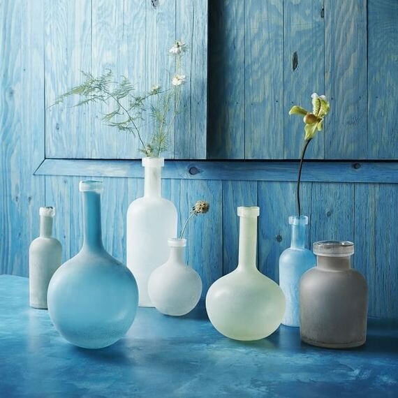
West Elm's Waterscape vases in blue and and green
(neighbours on the colour wheel)
3. Building a Family Part 2: Making New Friends
-Once you're comfortable with your monochromatic look, the best way to expand your horizons is by colouring just a little outside the lines. By adding some undertones of a neighbouring colour family, you can spice up your look without breaking the effect. For example, in my Cityline set, I introduced some blue-green tones that are just green enough to add variety but still blue enough to keep a tone-on-tone feel.
-Clear items (such as tinted glass) are a great way to introduce these new hues, as the transparency naturally helps them blend into the environment as your eye picks up some of the background colour.
-Neutrals are another important tool. I used a grey pillow and silver lamp to add some "colourless colour," but if you look carefully you'll notice that the woody table carries a distinct orange undertone. Complimentary orange definitely plays against the blue (its opposite), but the piece is neutral enough to not draw focus. You could add subtle navy to a warm scheme, or other barely-there colours like dark leaf greens (via plantlife) or subtle wine-brown leather.

Bonus: Your Origin Story
-Consider this the prequel-step! If you're having trouble committing to a singular colour statement, here's two sources for inspiration:
-First, your wardrobe is always a good starting point. If a colour looks great on you, you'll look great with it on your walls, so gravitate towards hues that you've returned to throughout the years (and don't worry about fashion trends).
-Second, consider magazines for inspiration; but don't grab one from the newsstand, and instead pull one from that dusty stack in your attic or from a used bookstore. If a colour from 10 years ago looks current to you now you'll still love it later--some colours just age better than others.
-If all else fails, blue is a perennial favourite: its very soothing, and easy to inject with a bold accent (like, say, a punchy pink?) if you get tired of the one-colour-life.
For even more advice on getting monochromatic right (all with affordable IKEA finds!) check out my Cityline segment on Cityline.ca.