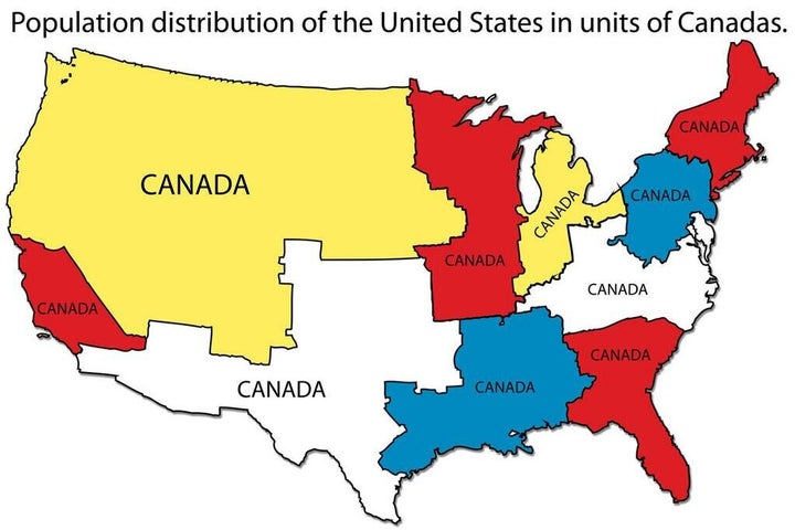
Everyone knows the U.S. population dwarfs that of Canada, but this graphic really brings home the scale of the difference.
Just look at California on the map below. With an estimated population north of 38 million people, the most-populous American state doesn't even need all of its landmass to match Canada's roughly 33 million people.

Advertisement
The map, which racked up more than 50,000 views on Imgur in less than 12 hours after being posted to Reddit, isn't the first crack at using units of Canada on a U.S. map.
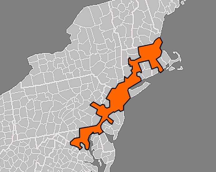
Just take a look at this smallest possible version of Canada, comprising the "megalopolis" of Boston, New York, Washington D.C. and Philadelphia.

Feel small yet?
Also on HuffPost
Advertisement
