Pantone 448 C, also known as Opaque Couché, has a new name: "the ugliest colour in the world."
After three months of investigation, market research firm GfK found the muddy olive hue to be the most offensive colour among 1,000 smokers.
Using this information, the company collaborated with the Australian government in 2012 to implement new packaging regulations on all tobacco products, with the intention of encouraging smokers to quit, the Sydney Morning Herald reported.

And it seems to be working. Since 2012, Australia's Department of Health has noted an 11 per cent drop in tobacco sales.
The concept has spurred several copy cats across Ireland, the U.K. and France, who are considering using the same shade, Cosmopolitan reports.
But staring at the camo green colour, which has been described as everything from dirt to tar to death, makes us think there has to be worse colours out there. According to GfK ugly runners-up included lime green, white, beige, dark grey and mustard.
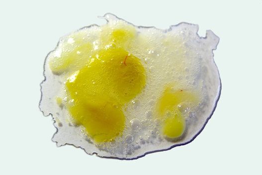
Below, we look at 10 other colours we'd argue are uglier than Pantone 448 C. Did we miss one? Let us know in the comments below.
