Although a designer's job requires knowledge about so many hidden technical details to make sure spaces look and function at their best, the first thing most clients notice is also usually the first area where people want advice: colour. Choosing the right hues can be easy when you have years of experience, but it's hard to know where to begin when decorating your own space -- and sometimes knowing where to stop!
Since viewers get so many mixed messages from the many design shows on the airwaves, I decided to do a little colour correction of my own, and gave my Cityline viewers a lesson this week on how to choose the right colours for you, no matter what your taste.
Here's my top 5 tips, including a few lessons we couldn't fit in on air:
1. Start with "Number 1"
One of the most important steps to creating an attractive colour palette is to find a family of colours to focus on. However, just like when picking out an outfit, you don't want to choose just a colour you love, but one that also looks great on you.
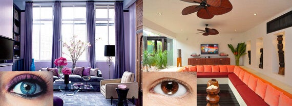
Your eye colour can guide you: people with brown eyes glow in spaces filled with rich neutrals and warm colours, while blue eyes sparkle when surrounded by lots of lavender. To create a scheme that looks beautiful and that you look your best in, consider browsing your own wardrobe to pull favourite colours that flatter you -- this will give you a starting point for dressing your walls that you know you'll look and feel good in every day.

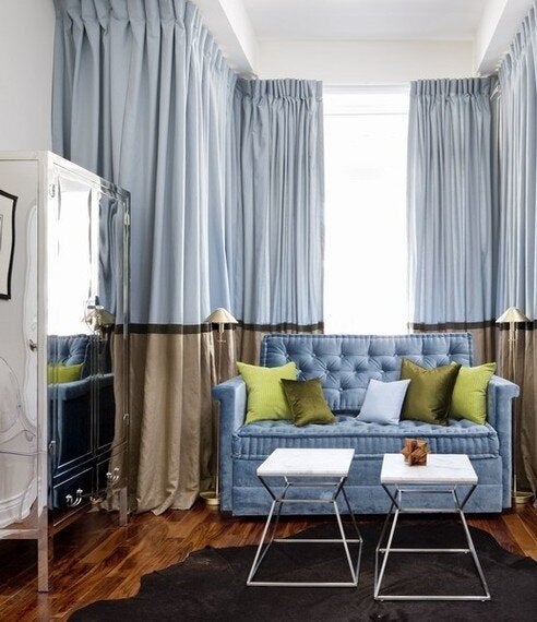
On Set: I chose Benjamin Moore's #2104-30 Harvest Brown, to relate to the sofa (from Zilli Home Interiorsalong with the rest of the furnishings) without matching.
2. Don't Be Too Serious
If you've decided blue is your hue of choice, you've got a great start. HOWEVER, this doesn't mean you should get too strict! Trying to make everything in your space one shade of blue will lead to overload, and suppress your creativity rather than making decisions easier.
This is especially true when picking a wall colour: rather than trying to exactly match a fabric or art piece, choose something more toned down for the paint (lighter, mixed with more grey, or both). Contrast is key for creating a space with inviting depth, so make sure to include variety -- small accents like pillows, art and accessories are perfect opportunities to include unexpected pops of colour, so go ahead and break your own rules!
3. Show Your Range
After the fun of choosing the bright, bold hues to feature in your scheme, don't forget to give them a base to stand on: neutrals. To a colour lover, a humble beige may seem boring, but it's important to give the eye some points of rest. To keep things interesting, you can chose patterned or textured pieces in neutral hues, such as animal print chairs, shag rugs, printed pillows, plush throws, or geometric draperies.
Likewise, even if your taste is more neutral-focused, it's important to have a full spectrum of colour values: the darkness or lightness of any hue. A few hits of white and black, even in small details like picture frames or chair legs, will highlight the subtle beauty of your main colours and give the range of tones your eye naturally expects to see.
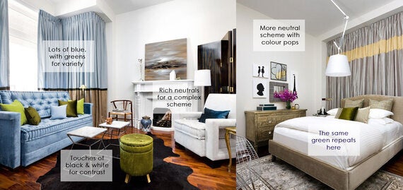
At Home: Even though the bedroom is more neutral than this sitting area, the green accents connect.
4. The Colourstory Continues
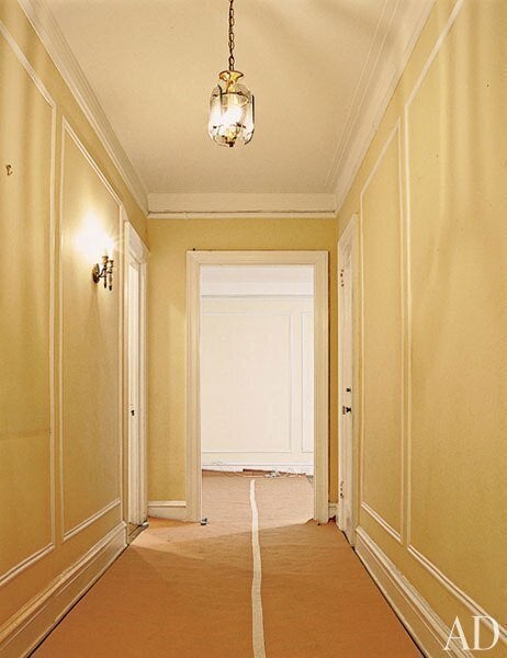
Although TV shows often love to show "theme" rooms to get the most dramatic makeover results (and makeover reactions!), when decorating any space in your home, you should remember how it will connect to the other spaces nearby. Stand in a hallway, and look at all the doors you can see opening up from this space -- the rooms should look beautiful together, rather than disconnected. Giving your entire home a thread of continuity (even across floors) brings a feeling of harmony and makes a memorable statement.
I typically choose one main wall colour to use throughout a home (Benjamin Moore's #OC 23 Classic Gray being a favourite), but you don't have to -- just take colour swatches into rooms you already love, and consider whether the new selections could make sense with what you have.
5. Let the Room Evolve
Lastly, keep in mind that designing a space never really happens all at once: there's always room to change, add, and subtract pieces over time, so there's no pressure to get your colour scheme perfect from day one.
Start with the essentials (your must-have furniture, unforgettable heirlooms, and a wall treatment that ties it all together), and keep these in mind when deciding on the unexpected finds and finishing touches. You can always experiment by using pieces in new rooms and combinations, and slowly replace anything that doesn't fit until everything feels just right.
To see the Cityline episode and watch my set transformation in action, visit http://video.citytv.com/video/detail/2841866066001.000000/november-18-2013--around-the-house/, and for a some fun colour finds check out my Keep Up with Yanic Blog on http://tidg.ca/keepupwithyanic/.
